Introduction to Color Grading in Premiere Pro
This article is the first part in a series on Color Correction in Premiere Pro CC.
It will give you a tour of the Lumetri Color tools, go over all the settings, and introduce you to some important color-correction terminology.
I’ve been working as a professional colorist nearly as long as I’ve been video editing.
Though a great tool for most things color grading is Davinci Resolve, I find the color correction tools and workflow in Premiere Pro is a super easy way to do color correction as part of the video editing process in post production without having to leave for another app.
In the classic Davinci Resolve vs. Adobe Premiere Pro argument about Which is Best for Color Grading?
Experienced colorists will say Davinci Resolve wins hands-down.
But if you do not have the time or the budget on a project to output an entire timeline over to Resolve for color grading and then return it to Premiere Pro for finishing, the Lumetri panel in Premiere is more than adequate for doing color correction quickly.
This page may include affiliate links.
Though I only recommend software that I use and fully believe in.
⭐⭐⭐⭐⭐
I pay for Adobe Creative Cloud and have used it every day in my 20-year career as a video editor, producer, and colorist.
Purchasing Adobe CC through these links will get you the best deal available and support this site.
Get Adobe Creative Cloud Now!
Guide to Color Correction in Adobe Premiere Pro Lumetri Color Panel
Let’s define a few color correction terms before we get too far into this article.
What is White Balance?
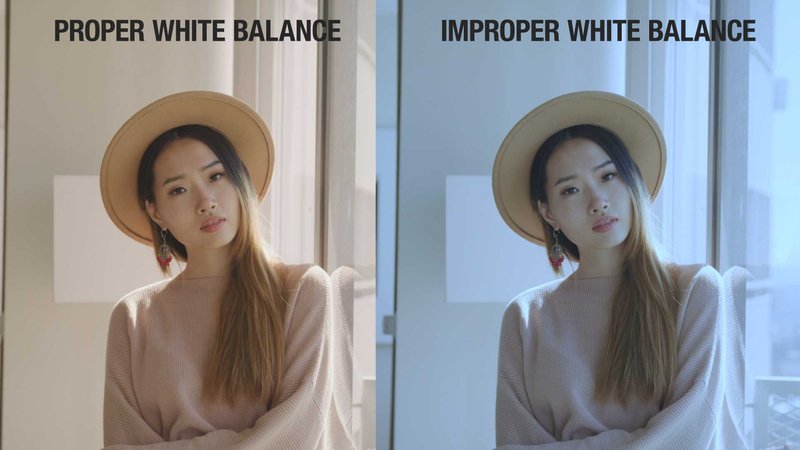
White balance is the color temperature in which white things look white. This balance affects all of the other colors in video clips as well.
A video camera has a white balance setting based on the light sources lighting the shot.
Different types of light sources have different color temperatures (think natural sunlight, LED light, tungsten light, etc).
Adjusting white balance is a basic correction in the color grading process in which you adjust the highlight tints to make whites appear correct.
What is Contrast?
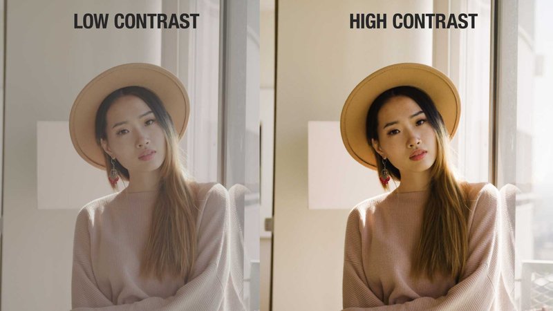
Contrast is the distance between the brightest and darkest parts of a video clip.
High contrast makes video clips pop and have more intensity.
Low contrast may look duller and more muted.
Neither is a more correct look, it depends on the look you’re going for in your color grade.
Adjusting contrast is a basic correction in the grading process.
What is Saturation?
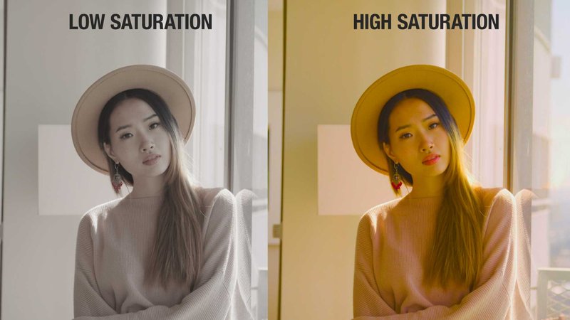
Saturation is the amount of color information in your shot.
Higher saturation levels mean more vivid and intense the colors are. Low saturation levels mean more muted colors.
And No Saturation means black and white.
What is Skin Tone?
Like White Balance, the skin tones of an image with a human subject affect the overall quality and reality of an image.
Skin tones that are incorrect can be jarring to the viewer.
Generally speaking, getting skin tones to fall along the Skin Tone Line on a vectorscope will yield perfect skin tones, regardless of the ethnicity of the subject in the shot.
Color grading skin tone in Premiere Pro is one of the most important things to learn when starting out.
What are Highlights, Mids, and Shadows?
Like they sound, these are the high, middle, and dark parts of an image.
Generally color wheels used in color grading tasks are broken up into these three sections of a picture and you can make corrections to each part of the image.
What are Color Wheels?
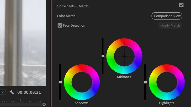
Color Wheels are classic color-correction color tools where three wheels (or more, depending on your color format) represent the shadows, midtones, and highlights in a shot.
Around the wheel are all the colors in the video gamut.
To color correct, moving the center controls of color wheels pushes that part of the video (again, adjust shadows, midtones, or highlights) towards that color.
What does the Vectorscope Do?
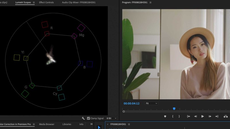
The vectorscope on the Lumetri scopes panel (when selected in the program monitor) shows you the saturation levels of the color information in an image.
The color targets: Red, Magenta, Blue, Cyan, Green, and Yellow . . . represent maximum legal values for broadcast.
There is a skin tone line that will help you diagnose color casts in skin tones.
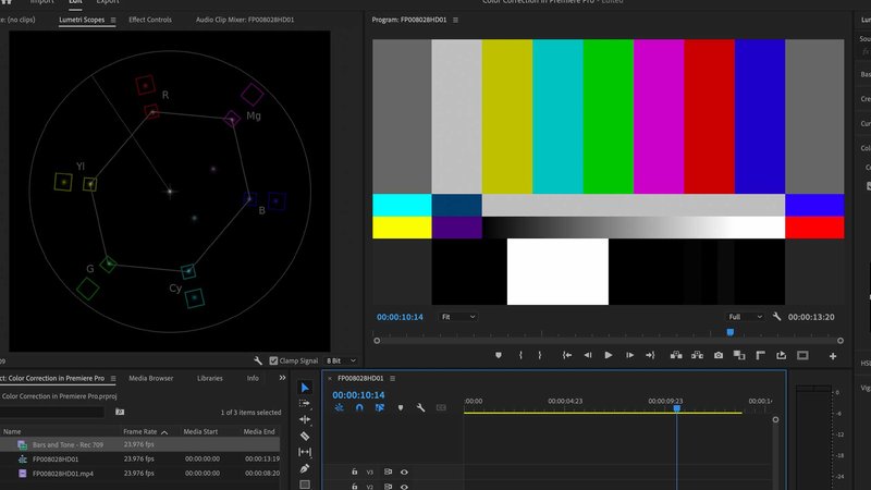
If you look at standard Color Bars in the vectorscope, you can see an interesting pattern with each color hitting each target.
Overall, use this to gauge the saturation of your image and see if any color is out of range.
What Does the Waveform Monitor Do?
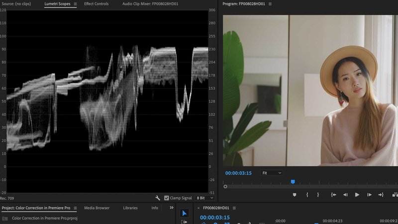
The Luma Waveform monitor on the Lumetri Scopes Panel (when selected in the program monitor) shows you the relative levels of luma and chroma in your image, from shadows at the bottom to highlights at the top.
The waveform is tinted to show you where specific colors lie within the gamut.
It’s currently set to Luma to show the brightness information, or I could set it to Chroma to show the color information.
Generally I use this display to see my contrast.
I can stretch the shadows to the bottom at 0 and then my highlights to the top at 100.
Depending on where you’re delivering your video, these are the safe limits for broadcast.
What Does the RGB Overlay Histogram Do?
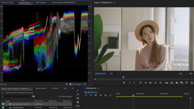
The RGB overlay Histogram on the Lumetri Scopes Panel combines the Red, Green, and Blue values on one display and shows you the number of pixels of each across the IRE gamut.
Unlike the Waveform we just saw, this doesn’t really tell you how bright or dark the image is, just how much of each color value is at each brightness level.
What Does the RGB Parade Do?
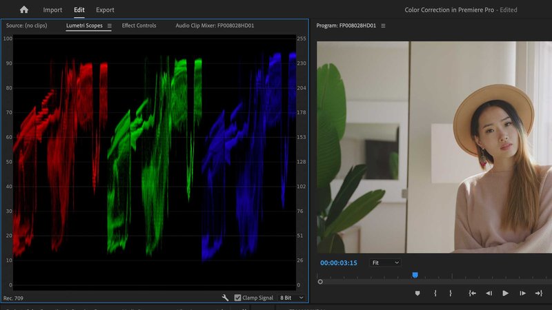
The RGB Parade on the Lumetri Scopes Panel is a Waveform display that shows you the relative levels of Red, Green, and Blue in your image.
I use this to balance the image.
If there’s something that’s supposed to be neutral in the image, but the scopes tell you it’s not, I’ll make an adjustment with the color wheels.
This image looks a bit too warm to me and the RGB Parade confirms that with the levels higher in the reds. I’ll rebalance while keeping an eye on the scopes.
What is Primary Color Correction?
Primary Color Correction is generally the first things you do to a clip: white balance, adjust contrast, and address any overall color cast.
What is Secondary Color Correction?
Secondary Color Correction hones in on specific issues with a video clip and allows you to fine tune and make further adjustments to the image.
The Lumetri Panel offers different ways to isolate parts of your image and address them alone.
Color Grading in Premiere Pro Workflow
Next I’d like to go over my workflow for color correction when I’m video editing.
First off, it’s nice to have a dedicated color workspace to correct video separate from video editing.
I go to the Window Menu, then Workspaces / Color.
This brings up the Lumetri Color panel on the right and your source monitor on the left has a tab for the Lumetri Scopes.
The scopes should be visible at all times while you’re color grading.
The layout I prefer is RGB Parade and Vectorscope.
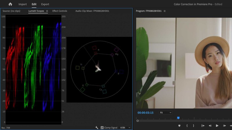
Between these two scopes, I can see pretty much everything I need to see:
- Overall RGB color balance
- Overall Contrast
- Overall Saturation
Let’s go over the Lumetri Color Panel, pane by pane, and cover what each thing does.
Lumetri Color Panel - Basic Correction Section
This is your first section, and where you’ll do most of your work.
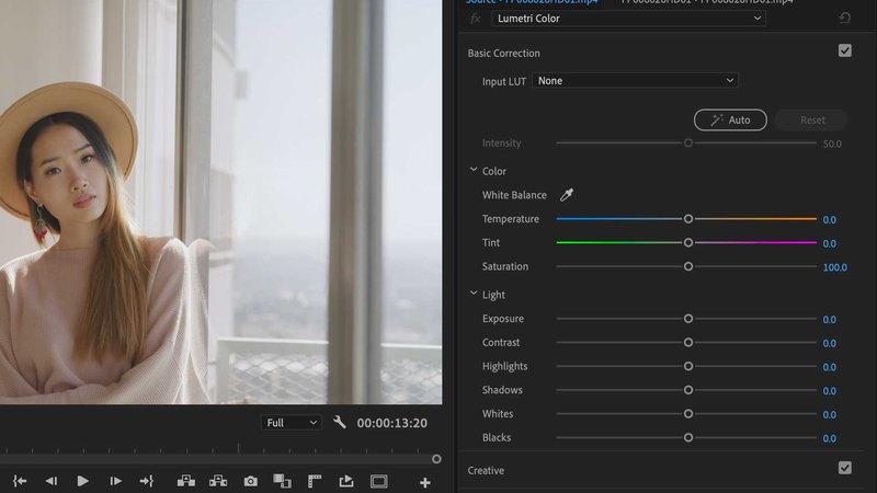
Input Lut
This is where you can load a camera input LUT if your footage is in a LOG or RAW format.
This will give you a good start on color correction, or, at the bare minimum, make footage appear correctly when viewing with or sending to a client.
Included are some popular camera LUTs, but you can easily load up your own.
Auto Color Correction
There is nothing wrong with clicking the Auto Color Correction button to see what the Lumetri Color Panel thinks is a good correction for your clip.
The sliders below will reflect the correction to color and luma.
The intensity slider eases off or doubles down on the correction, and the sliders below will reflect that.
Hit the Reset button if Lumetri is way off or use this as a jumping off point for your fine-tuned correction.
Color - White Balance
Included is a medicine dropper color sampler you can use to choose a white portion of your image.
Lumetri will then adjust the white balance automatically for you.
Color - Temperature and Tint
The Temperature slider represents a Cool / Warm or Blue / Orange correction.
And the Tint slider represents a Green / Magenta correction.
Use these sliders while looking at the RGB parade, which shows you RGB balance.
You can easily get a nice image by making the different areas of the RGB parade scope even out or line up to a proper tonal balance.
Light - Exposure and Contrast
Use the Exposure slider to add overall brightness to your image.
Think of this as like a Gamma slider.
Use it in conjunction with the contrast slider, which will shrink or stretch the contrast of your image.
The contrast slider adjusts contrast with a standard “S” curve.
Light - Highlights and Shadows
The highlights slider adjusts the very brightest parts of the image.
Use it in conjunction with the Shadows slider, which adjusts the very darkest parts of the image.
Light - Whites and Blacks
The Whites and Blacks sliders are a more straight-up Gain slider for the top and bottom of the image.
Lumetri Color Panel - Creative
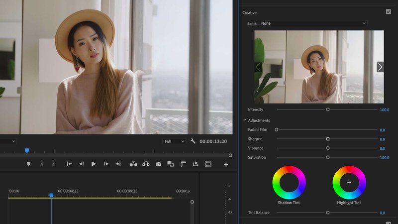
The creative section is, like it says, giving you some more creative controls over your image to come up with a “look” as opposed to surgical correction.
Look Menu
First up, there is another LUT section in the look drop down menu.
Preloaded in it are a ton of preset looks you can try out on your footage. Everything from film emulation to classic looks.
Plus, you can load up your own LUTs if you’ve purchased them from third parties.
A very cool feature is the Look Preview window below this menu.
Use the arrows on each side to scroll through the different looks to find one you like.
When you find a look you like, the Intensity slider will adjust its overall intensity on your clip.
Adjustments
Next up are some creative adjustments you can make to your footage.
- Faded Film adds a low contrast film look
- Sharpen is a sharpening effect
- Vibrance is a saturation control that should go easy on skin tones but add saturation to everything else
- Saturation controls the overall chroma or color level of the clip
Shadow and Highlight Tint
Use these two color wheels to add a color cast to your shadows and/or your highlights.
This is an easy way to dial in the popular “Blockbuster Look”, which means pushing your shadows to a cool blue / cyan and pushing your highlights to a warm / orange for color contrast.
Lumetri Color Panel - Curves Section
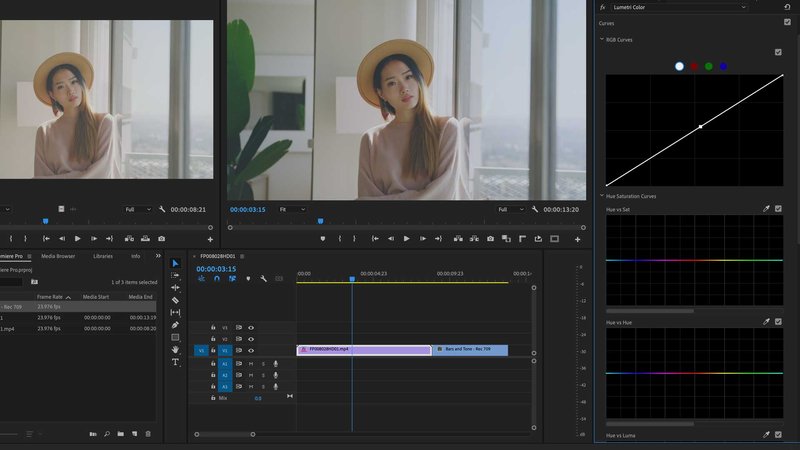
Curves are a popular alternate way to color-correct.
Often photographers or graphic designers coming from the Photoshop world like to adjust color using curves.
Curves can make gentle, easy corrections to color and contrast, plus there are very surgical tools to make secondary corrections in your footage.
RGB Curves
Add points to the main (white) line in the RGB curves control to adjust brightness in different areas of the image. The left is shadows and the right is highlights.
Create a classic “S-Curve” by putting dots at about 25%, 50%, and 75%.
Pull down a bit on the 25% dot and push up a bit on the 75% dot and you’ve made a gentle, S-curve adjustment to contrast.
Choosing the Red, Green, or Blue dots at the top of the RGB Curves allows you to make similar corrections to the Red, Green, and Blue parts of the image.
You’re probably starting to see the power and possibilities here, by now, right?
A Quick Note About Secondary Corrections
What follows with these curves controls denotes “secondary” correction, which generally is done after your Primary corrections (adjust brightness, contrast, and any overall color casts).
Secondary corrections generally are improved with some sort of mask or tracked mask (if the object you’re correcting is moving) so the surgical corrections you’re doing to the colors in that object don’t affect similar colors in the rest of the image.
Hue vs. Sat
This is a secondary correction curves tool that is represented by a horizontal line denoting the color wheel.
Putting a dot at a specific Hue adjusts up or down the Saturation of that hue.
Use the medicine dropper color picker to choose a hue in your image and
Lumetri will place a dot on the line for you to make your adjustments.
On any of these corrections, add dots to the left and right of your main dot to control the “width” of your adjustment.
A wide color adjustment will adjust many related colors, a narrow color adjustment will only adjust a few specific colors.
Uses for Hue vs. Sat:
- Desaturate a tricky oversaturated color in an image
- Add saturation to only one object that should appear with more punch in the shot
Hue vs. Hue
This is another secondary correction that allows you to change the color of a color.
Again, use the medicine dropper to choose your color and then it will place a dot on the line at that hue.
When you drag the dot up or down, you’ll get a vertical color line showing you what you’re adjusting that color to.
Uses for Hue vs. Hue
- Change the color of something in your shot, whether slightly or drastically. Grass looks too yellow but should look more green? Choose it with the color picker and push that hue to green.
Hue vs. Luma
Another secondary correction that allows you to control the brightness of a specific color.
Use the color picker to choose the color and you can lighten or darken items of that color in the image.
Uses for Hue vs. Luma
- Brighten up something in the shot
- Darken or “stop down” something in the shot that is distracting
- Lighten skin tones
- General relighting of objects based on their color.
Luma vs. Sat
Secondary correction that allows you to saturate or desaturate a portion of your image based on its brightness.
Uses for Luma vs. Sat:
- Desaturate the darkest parts of your image, something that the eye naturally does at night
- Add or remove saturation from the midtones of your image, leaving the highlights and the shadows alone
Sat vs. Sat
Secondary correction that allows you to saturate or desaturate a portion of your image based on its existing saturation.
Uses for Sat vs. Sat
- Desaturate all of the most saturated parts of the image, or
- Add saturation to all the least saturated parts of the image, or
- Boost or Cut saturation in the middle of the saturation range, leaving the rest alone
Lumetri Color Panel: Color Wheels & Match
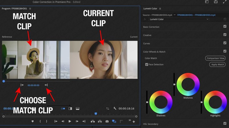
The Lumetri Color Panel offers a Color Match feature for comparing different shots.
When you turn on Comparison View, you can choose a Match Clip from your timeline by adjusting the timecode in the Reference Frame or by clicking the Previous and Next Edit buttons.
When you find the clip you’d like to colour match, click Apply Match, and Lumetri will do its best to match your current clip to the reference clip.
If “Face Detection” is chosen, Lumetri will use AI to detect a human face and do its best to retain skin tones.
Next up are the standard 3-Up Color Wheels that are generally familiar to anyone who’s done color correction before.
The wheels control the color of the Shadows, Midtones, and Highlights. The sliders next to the wheels control the brightness of each of those zones.
Getting comfortable with Color Wheels is a great step toward mastering color grading.
Learning how to add color or take it away intuitively will make your color correction fast and easy.
Practice Practice Practice!
Leave your scopes on to see what pushing those color wheels does to your image.
Learn about the complementary colors on the color wheel – are your highlights too cool or blue? Push the highlights to yellow / orange.
Are the mids too green? Push the mids toward magenta.
Not looking right? Maybe you chose the wrong complementary color, so instead of pushing out towards the edge of the circle, move slightly around and see how that affects the color.
Lumetri Color Panel: HSL Secondary
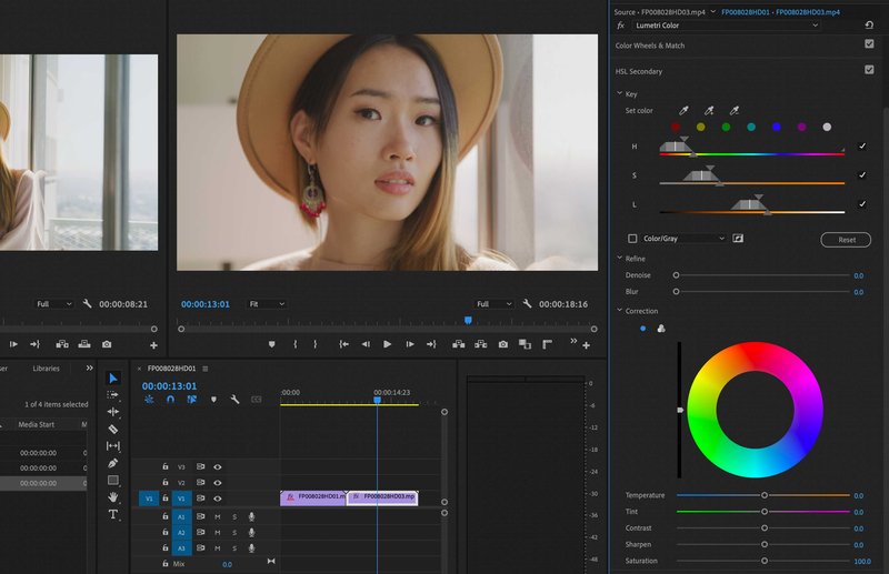
The HSL Secondary is where you can isolate colors and adjust them surgically.
HSL means:
- Hue - each color around the color wheel
- Saturation - the amount of that color from grayscale to fully saturated
- Luminance - the brightness of the color
If you’ve ever done any work pulling a key with a green screen, many of these controls will be familiar to you.
HSL Secondary - Key
In the Key section, you can choose and refine your color range.
In the picture above, I took the first Set Color medicine dropper and dragged it across the subject’s cheek to isolate skin tones.
You can see the range on each of the H, S, and L lines below.
Use the Set Color “+” medicine dropper to sample another color and add it to your selection.
Use the Set Color “-” medicine dropper to sample another color and remove it from your selection.
You can also select major primary and secondary colors by clicking any of the colored dots below the medicine droppers.
You can refine your matte (the chosen colors in your image) by using the HSL sliders below.
To see what you’ve chosen, you can choose a matte display from the drop-down below.
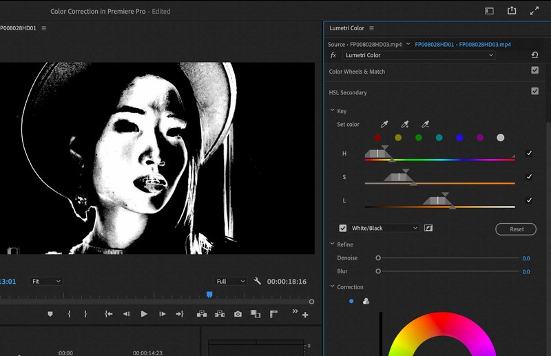
With the matte displayed, it’s easier to refine the matte and choose only the colors you’d like to affect.
The HSL sliders allow you to
- Widen or shorten the selection to increase or decrease the size of the selection
- Adjust the softness of the edges of the selection. This will result in a more natural falloff.
- Turn on or off any of the sliders to leave them out of the selection.
Using the HSL sliders becomes easier with practice and you’ll be isolating specific colors naturally in no time.
HSL Secondary - Refine
The Refine section allows you to refine your matte by:
- Denoising - this removes “noise” from the edges of your selection and will help make the key look more natural
- Blur - this will blur the edge of your selection for a softer rolloff.
HSL Secondary - Correction
Here is where you’ll do the actual color correction on the selected color range above.
You can choose between a single color wheel (this general will do the trick on a tight selection), or you can choose a 3-way color corrector to really dig in to the Shadows, Mids, and Highlights of your selection.
Below this are additional controls that you are familiar with by now:
- Temperature (cyan vs. orange)
- Tint (green vs. magenta)
- Contrast
- Sharpen
- Saturation
Using the tools in the HSL secondary really allows you to dial in a correction to fix a very specific part of your image.
HSL Secondary - Vignette
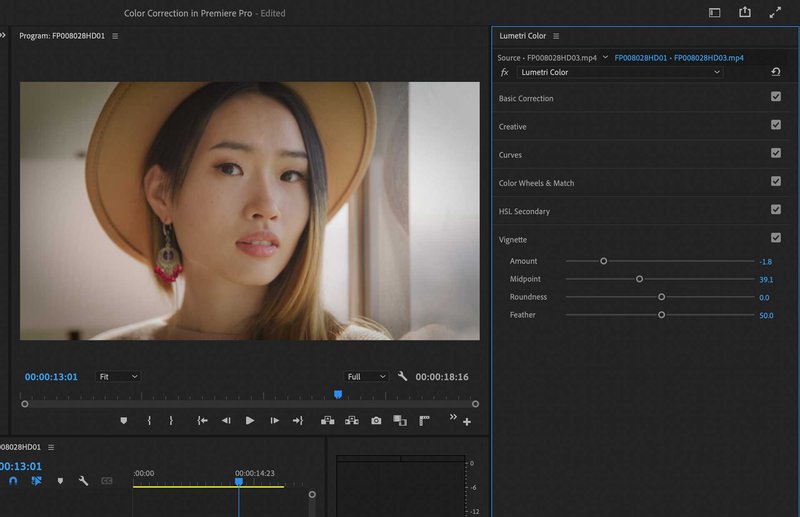
Finally, we have some controls to add a vignette for stylistic purposes.
The amount slider, at zero, has no vignette.
In the negative (as in the image above), there is a darkening vignette. In the positive, there is a white vignette.
There are additional sliders to control the way the vignette looks, like roundness and feathering.
A strong vignette can be used as a stylistic look.
A subtle vignette can draw the viewer’s eye to a specific part of the image.
Either way, vignettes are a common tool in the color grading workflow.

Color Grading in Adobe Premiere Pro Frequently Asked Questions
How Do You Color Grade in Adobe Premiere Pro?
You use the Lumetri color panel to make adjustments to your footage. Basic color correction includes adjusting white balance, contrast, balancing skin tones, and matching clips.
Does Adobe Premiere Pro have LUTs?
Yes! A LUT (or Look Up Table) is a color correction baked into a file that you can load up into the Lumetri panel in your video clips as a starting point for your color grading workflow. Generally LUTs are used to begin with a basic color correction for LOG footage from specific cameras. This is called an input LUT.
LUTs can also be used to load up specific “looks” that you might be going for. This is called a Custom LUT. Custom luts can be created yourself or purchased from third parties.
Sometimes it makes sense to add a LUT to an adjustment layer to affect all the clips on your timeline (unless you are mixing different formats in your project).
Is it Better to Color Grade in Adobe Premiere Pro or After Effects?
Both Adobe Premiere Pro and After Effects support the Lumetri effect for color correction, but its use in After Effects is likely best for the basic color correction of specific layers of your motion graphics composites, as opposed to full-timeline color grading of a sequence.
What is the Difference Between Color Correction and Color Grading?
Generally the terms are interchangeable but Color Correction is more about fixing or repairing the color of a clip. Color Grading refers more to the process of creating a cohesive or aesthetic look for a clip or a sequence.
Do I Need a Control Surface For Color Grading?
Not necessarily. But you might find the whole color workflow process faster using a dedicated control surface. I personally use the Tangent Wave Panel.
Another benefit of a control surface people don’t consider is the fact that a lot of corrections (like contrast adjustments) really benefit from hands on two different wheels, pulling them apart.
Should I be Working on Basic Correction While I’m Video Editing?
In a situation like video editing in Adobe Premiere Pro, there’s no reason not to be doing some basic correction while you’re still in the cutting process. Just don’t let it get in the way of the edit!
***
So that was our tour of the Premiere Pro Lumetri Color Panel. Stay tuned to this website for further in-depth articles on color correction in Premiere Pro (and other apps, of course!)

About the Author
Joseph Nilo has been working professionally in all aspects of audio and video production for over twenty years. His day-to-day work finds him working as a video editor, 2D and 3D motion graphics designer, voiceover artist and audio engineer, and colorist for corporate projects and feature films.
Video Editing Related Posts
Adobe Creative Cloud for Video Editing
Top 10 Video Editing Software for Mac
The Benefits of Dual-Monitor Setups for Video Editing
How to Choose the Right Video Editing Monitor for Your Needs
Best Monitors for Video Editing
Best Video Editing Software in 2023
Best Mac for Video Editing in 2023
(Almost) 50 Mistakes Every New Video Producer Makes
Breakthrough AI Tools: Elevate Your Video Production Game!
Parent Article:
Log Video Formats Reference Guide
Related Articles:
The Evolution of Log Video Formats
Demystifying Log Video Formats
Log Video Formats vs. Traditional Video Formats
Top 10 Log Video Format Cameras
Color Grading Techniques for Log Video Formats
The Impact of Log Video Formats on Modern Cinematography
Mastering Post-Production Workflows for Log Video Formats
Best Practices for Archiving and Storing Log Video Format Files
Table of Contents
- Guide To Color Correction In Adobe Premiere Pro Lumetri Color Panel
- White Balance
- Contrast
- Saturation
- Skin Tone
- Highlights, Mids, And Shadows
- Color Wheels
- Vectorscope
- Waveform Monitor
- RGB Overlay Histogram?
- RGB Parade
- Primary Color Correction
- Secondary Color Correction
- Color Grading In Premiere Pro Workflow
- Basic Correction Section
- Creative Section
- Curves Section
- RGB Curves
- Hue Vs. Sat
- Hue Vs. Hue
- Hue Vs. Luma
- Luma Vs. Sat
- Sat Vs. Sat
- Color Wheels & Match
- HSL Secondary
- Vignette
- Color Grading In Adobe Premiere Pro FAQ
Video Editing Related Posts
Adobe Creative Cloud for Video Editing
Top 10 Video Editing Software for Mac
The Benefits of Dual-Monitor Setups for Video Editing
How to Choose the Right Video Editing Monitor for Your Needs
Best Monitors for Video Editing
Best Video Editing Software in 2023
Best Mac for Video Editing in 2023
(Almost) 50 Mistakes Every New Video Producer Makes
Breakthrough AI Tools: Elevate Your Video Production Game!
Parent Article:
Log Video Formats Reference Guide
Related Articles:
The Evolution of Log Video Formats
Demystifying Log Video Formats
Log Video Formats vs. Traditional Video Formats
Top 10 Log Video Format Cameras
Color Grading Techniques for Log Video Formats
The Impact of Log Video Formats on Modern Cinematography
Mastering Post-Production Workflows for Log Video Formats
Best Practices for Archiving and Storing Log Video Format Files
